How to Display the Temperature Properly
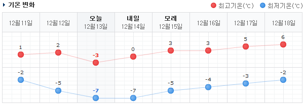
| Naver has one of the best graphical temperature visualizations. Simple, clean, with the right amount of information. You can probably figure it out even if you can't read Korean or don't use Celsius. |
Web sites in Korea are usually usability disasters, but every so often I come across a true UX gem. Take Naver's visualization of temperature over time, for example. I've seen many other temperature graphs, but Naver adds one tiny feature that makes theirs immensely more usable: the temperature from yesterday and the day before. That extra little bit of historical information makes the current temperature and forecast temperature much easier to read.
Temperature is a funny metric. I find it difficult to correlate this number with how it really "feels." If it's 47 degrees outside, should I dress really light or really warm? The answer probably depends on the temperature from the previous few days. I think we adjust to the current season and climate. If it was previously 30 degrees, 47 degrees would feel warm. But if it was previously 70 degrees, 47 degrees would feel very chilly. And 47 degrees for a Minnesotan is very different than the same 47 degrees for a Californian!
Now, as you may have guessed, I was using Fahrenheit temperatures above. I'm used to the Fahrenheit system because I grew up in the US. However, Korea uses the Celsius system. Conversion requires both a scaling (multiplication) and a translation (addition) operation. It's hard to enough to get a sense of the Fahrenheit temperature; the converted Celsius temperature is even more difficult!
Naver's temperature graph beautifully transcends all the difficulties of reading a numeric temperature. Temperature is a relative experience (heard that story of how you can boil an unwitting frog by s-l-o-w-l-y raising the temperature?) Naver's temperature chart lets the user read the temperature the way they experience it: relatively.
Even if Naver displayed the temperatures in an odd, unfamiliar unit like Kelvins, I can immediately get an accurate "feel" for the temperature. I know what the temperature felt like yesterday or the day before, so I just look at the relative change in temperature. Did it go up, down, or stay the same? By how much?
Now, WeatherSpark does show the previous temperature history. But they show too much information. Normally I neither need, nor want, the weather history and forecast at one hour intervals. It's just information overload. Naver shows just the right amount of information: the high and low temperatures, as two line graphs. The high temperatures are colored red, and the low temperatures are colored blue. This seems like a small detail, but it's very confusing when executed incorrectly. Most people associate warm colors (like red) with higher temperatures and cool colors (like blue) with lower temperatures.
Well done, Naver!


Comments
Post a Comment