Posts

Showing posts from 2013

How to Display the Temperature Properly

Image
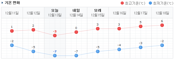
Naver has one of the best graphical temperature visualizations. Simple, clean, with the right amount of information. You can probably figure it out even if you can't read Korean or don't use Celsius. Web sites in Korea are usually usability disasters, but every so often I come across a true UX gem. Take Naver's visualization of temperature over time , f or example.  I've seen many other temperature graphs, but Naver adds one tiny feature that makes theirs immensely more usable: the temperature from yesterday and the day before. That extra little bit of historical information makes the current temperature and forecast temperature much easier to read.

Open Letter to Wells Fargo: Farewell~

Image
Dear Wells Fargo, The fragment of my Wells Fargo debit card taped to this letter attests to the fact I was your customer for 24 years. Today I closed my Wells Fargo accounts. Let me explain why you are losing customers like me. Who knows how many hundreds or thousands of other dissatisfied Wells Fargo customers simply switch away from your bank without even explaining. Like my brother did. I closed my accounts due to the atrocious Wells Fargo banking experience. For example: one day, with neither warning nor explanation, my checking account just vanished from the Wells Fargo site. If that wasn't frustrating (and scary) enough, what should have been a simple fix with a single phone call was drawn into an agonizing month of repeatedly contacting various incompetent representatives. From my experience, it seemed like the representatives were paid by the number of cases they handled per hour. Their responses looked copy-pasted from generic boilerplate templates and often, in the